Saturday, 27 October 2012

Fourteen hands of Fate and Fortune

This week, I was lino-cutting. I wanted a design to print onto scarves and t shirts that would be less ironically sweet than the owls and rabbits, and I decided to use The Hand of Fate and Fortune. I photographed each step, and thought I would give you all a tutorial in lovely basic lino-cutting.

Upscaled sketch of The Hand Of Fate
The original Hand of Fate was a small design and would have been quite difficult to cut, so I began by upscaling the drawing to actual hand size, and simplifying it slightly.
Completed tracing with my sheets of lino
My next step was to trace the image onto baking paper. The easiest way to do this is to cut the paper to the same size as the lino, and then use masking tape to secure it over the drawing. Once you've traced it, lay down the pencil drawing, face to the lino, and tape it down again. I'm using the soft silkcut lino, which is a lot easier to use than the old kind.


Tracing paper and 5B pencil


Transferred image!
I know that this is probably something you would all work out, but I like to cut around the outline of a drawing first, and then work my way up. That way you don't end up rubbing out your carefully transferred pencil guide with your wrist as you cut. The aim is to cut as smoothly as possible, with a regular depth to the lines. They can't be too shallow or they get swamped by the printing ink.

Depth of cut
Trying to show here the kind of depth that is desirable, I like to use a number 9 cutting blade (the number is on the back). The sharper the blade is the easier it is to cut smoothly.


Partially cut design
                                       

The finished cut! It's not traditional(See the Lino-cuts in my post The Maiden In The Tower), but with my Printed Ghetto cuts I'm using scissors to trim around the edge of the image so that there isn't a huge square of ink on the shirt or cushion I'm embellishing. I'm using my ink for fabric from The Indian Block Printing Company again, mixed with a really small amount of red. The correct way to print now is to apply the ink to the block with a roller (correct Printmaking name: brayer) then lay the paper or fabric over the printing block, it is then smoothed down using circular movements with a tool called a baren, although it's okay to use a wooden spoon. Because my prints are going onto a vest top, and it would be difficult to place them correctly, I am printing downwards onto the fabric. 

And here are my initial prints onto clothing! They are smoother and more defined than you can see in the photos. My intention is to print some smaller patterning around the hands, before embroidering into the print the same way that I did with my cushions. 


Initial prints onto shirt


I hope that this was useful if you are interested in making your own lino-cuts, and interesting if you like The Printed Ghetto. Please leave a comment as I would love to know what people think. Thank you for reading!


Saturday, 20 October 2012

Out Of The Strong Came Forth The Shadow Of The Apocalypse


In contrast to the cushion embroidery sweetness of my previous post, I will be writing today about THE APOCALYPSE. Or more specifically, a pretend film about a pretend apocalypse or revolution (it’s safer and equally fun really). I’ve been doing some promotional material for this film, with the idea that people may want to buy it and put it on the wall, where it will look down and make the room seem edgy and design orientated but also slightly violent.

This looks like it may be advertising violence, yep? 
This is the original photograph, there's no question it's much better in colour, but  I'm trying to keep the palette limited to monochrome for the time being because then I can afford to have them printed.
                                     
This is the background and border of the poster images. It's from a photograph I took from a window in the center of Manchester, thinking that the colours and the placing of the bridges looked very futuristic, and possibly post-apocalypse.

The reason this project began is because I was thinking about Che Guevara. I love Che Guevara, almost innappropriately. I love the semi-ubiquitous image on posters and flags and  the badges that the communists were flogging last year in Piccadilly, and I love his face in the regular photographs of him. I know he wasn’t a nice person, but that isn’t the point, because image of his face is iconic, and even though in principle any one of the rebel fighters in Cuba could have been photographed wearing a beret and looking into the distance, he’s the one that stands for revolution. This made me think about how any famous or iconic face is only there through chance, and anyone could be an iconic face. Later in this project, I hope to reference other themes that warrant promotional media, such as propaganda posters, and advertising for rock bands, but I’m starting with my imaginary film, you can decide what happens in it.


These images are square rather than rectangular, because that's their original composition, and I though that they made more impact as blog images, but I plan to place them on a oblong canvas for printing, as that's a more traditional shape for a poster. 

This photograph actually IS my sister, and most people who know her who have given me feedback have admitted to finding it mildly disturbing. She put the costume together herself and drew on the moustache and eyebrows.
I'm going to note here how I'm coming up with the slogans for my posters, because you are my special readers and can therefore be let in on some Trade Secrets. Well, semi-open if you have the internet secrets. I've been putting themes from the film, double identity, revolution, the apocalypse, into online slogan generators, and they tack meaningless advertising mush such as 'Brightens your day' onto the end. I was laughing for hours, and became concerned about what my neighbours would think as the walls are very thin. Here are some lovelies: 

'How many licks does it take to get to the center of the Shadow of the Apocalypse?'

'There's no wrong way to eat a double identity!'

'Easy, breezy, beautiful. Betray me and die!'

'1/10 of a revolution per minute-the other white meat.'

'The future is bright, the future is The Shadow of the Apocalypse.'

'Start YOUR day with the destruction of existence!'

Thank you for reading! I will update with links to my Etsy page once these have gone to print. Follow @PrintedGhetto on Twitter to see more poster designs.


Wednesday, 17 October 2012

Staring Creatures From The Ghetto

This week, my lovely, long neglected readers,  I'm going to tell you in some detail about how I made cushions. No- don't leave! I promise I will make it as interesting as cushion production can be. First, let me present my Printed Creatures. The birds have starey eyes, because the ghetto is dark.


These are Doris and Gerard. Doris is on the left. They say very little, probably because they are illustrations, but if they began to speak to me in a non-worrying-hearing-voices kind of way, they would be enigmatic.


This is Penelope, she's a bulldog. She doesn't have starey eyes, because that would indicate wide eyed naivety, and to me she looks cynical. You may have seen her before, if you came across the button cards.


Finally for now (I do have more creatures, but they are staying in the fictional ghetto, as they haven't yet been photographed) This is Henry the rabbit.

And now the cushions. I printed onto a recycled quilt I bought in a charity shop. (I suppose I thrifted and then upcycled it).


I printed the creatures onto the cushions using printing ink from The Indian Block Printing Company (www.theindianblockcompany.co.uk), which was very effective, it also has a nice shiny finish to it. It was a paler blue colour than the picture on the website, so I mixed it with some acrylic to make a deeper blue. 


Once I had my nice printed shapes on the cotton, I stitched around every contour I could reach with my sewing machine, then backed the print with some felt to make it stand away from the background more. On this particular cushion,  I gave Doris a kind of lacy black eye, and then embellished the background with some more stitching, over and around the existing pattern. I got a great thread set from Lidl, with lots of bright colours, which I used for this. This cushion is finished with some beads.


This cushion (featuring Henry) is the most heavily embroidered, with the most contrasting thread, and so far the only one I have given Coraline-style button eyes. The background of this one is outlined in fabric pen. Believe me, I needed a break from machine embroidery at this point. Current record of needles broken: Seven. In one day. 

Thank you for reading! I won't subject you to another blog post solely on cushion making, but if you would like to see more photographs as I make them, follow @PrintedGhetto on Twitter. I also post pictures of drawings and works in progress. If you are interested in buying a cushion,check out my Etsy page, OR my Folksy page

Tuesday, 7 August 2012

The Printed Ghetto


Linocut print: Penelope Bulldog :)

So I finally began this Business Start-up Thing. I graduated from college (hurray!), which was something of a culture shock as I went from having a basic structure of working to deadlines & specific criteria to... not really anything. It’s a jump to go from what Edexcel decrees you are going to do, to what you think the public may want to buy, in just weeks. I had also decided for some reason that I couldn’t begin properly until I had a good name. Realising that hard as choosing a name is, I would never get started if I didn’t just pick the one I liked the best, The Printed Ghetto was selected. Sometimes I gravitate very much towards pretty names, but I don’t want to be identified as a purely girly label, which I thought might happen if I chose ‘Sugar Bird’ or something similar, so I took one that sounded like it would work in a wider context.
I have been Making Things! Finally getting into it, and here are my things so far. Later I would like to branch out to more mounted prints & accessories like belts and scarves, but you do have to start somewhere, and it was nice to use my skills learned in Textiles and even Fine Art.


Vintage Buttons sourced from markets. On hand printed cards.


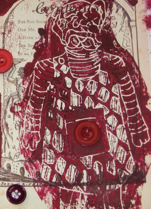
Cards of buttons are something that I love to buy, so I was really into the idea of sourcing and selling my own. I have been sourcing and collecting buttons for a couple of years so I already have a good stock, but recently I came across a strange and crazy stall in a market, selling really beautiful buttons that the stall holder assured me came from Spain (made by nuns?). It was fun making the cards, I photocopied pages from Victorian Magazines, and a girls annual from the 30's, and then printed onto them with my Penelope Bulldog Linocut.


Pyromaniac Flower Pins.
These pins were a good way to work in textile elements, & I added embroidery where I could. I like the Pyromaniac name, which comes from the method of production. The flowers are made from satin mix ribbon cut into circles & then melted around the edges. I used vintage buttons to back them before sewing on the pin backs, & to decorate the center of the flowers.

Four colours so far, orange, purple, brown and pink :-)

Card #1. I printed my own designs and images for them.
 The cards (like the buttons) are backed with printed card photocopied from Victorian magazines,  but rather than Penelope Bulldog they are printed with my Doris the Owl linocut.
This one to show off the card backing rather than the actual card,
I'm not sure which I am more proud of...

Card with a print from my Textiles A Level,
my sister likes this one because the original picture was of her.


My Ghetto Birds 
 The owls were probably the most complex to sew out of everything I have completed at this point. I had this sweet pattern which I adapted from burdastyle.com and again I worked in as much embroidery as possible. The owl on the far left, the only one so far which is definitely a girl, has eyes made from lace manufactured for lingerie production... (though never actually used for it). My favourite thing about these are their eyes so I plan to make them bigger and crazier the next time I make them.
Just one Ghetto Bird.

Hopefully my next post will not have such a massive gap in time before it as this one, thank you for reading! Xxx

Visit the The Printed Ghetto on Facebook, where you can see more photos and you are very welcome to ThePrintedGhetto, my etsy shop, where Things are for sale... :-) 

Wednesday, 9 May 2012

The Maiden In The Tower.

Rapunzel, The Maiden in the Tower
So, dear Readers, here I am with the next instalment of my Rapunzel-related-tale! The Maiden in the Tower is the first and best of all the Rapunzel stories, and I was pleased and relieved to come across it as I began my research. Having stated at the beginning of the project that my intention was to discover the ancient roots of the Rapunzel story, I was dismayed to read that the original story was apparently written in the 18th century by a scandalously behaved French lady named Madame de la Force! As I continued to search the wide and mysterious world of the internet however, I found that this was not the case. All that Madame de la Force did was write it down, in the same way as the Brothers Grimm, and the roots that I was looking for were not so hard to discover.

Is he a prince? Or just a personable young man?
The main factors of the Rapunzel story can be found in many fairy tales, evil witch, beautiful girl, rescue by a prince. The first thing that makes it different is the 'Maiden in the Tower' feature, which comes under the the 'Aarne-Thompson classification 310' (I had never heard of this before, but when you put it into Google exciting things happen!). Maidens, it seems, are imprisoned in towers all over the world by those who would like to keep them and their maidenhood locked away. A lot of them have sexy long hair and an appealing habit of being amazingly witless. I liked the stories about Maid Maleen and Petrosinella, who climbed out of their towers quite unaided and made off with their men. The second linking factor is obviously the hair. The Nordic tale links come across much more strongly here, long blonde hair denotes fertility and prosperity, and similar to how the tears from Rapunzel's eyes restore the sight of the prince, the (blonde) goddess Freya is said to have wept red tears for Odin that brought him luck in battle. My favourite theory behind the legend is that the story is at heart a cycle of womanhood and fertility. This links to a piece of pagan religion but I couldn't find anyone who could tell me about this in more detail, maybe a good thing... The woman is pregnant, the baby is born, she is a little girl, the old woman is past childbearing and takes her, she tries to keep the cycle from continuing by locking her up away from men, but the girl escapes and the cycle begins again with a pregnant woman. For the modern day version, read by children, they take all the sex and violence out, yes, it is a good thing given the audience... but it makes the story unrelatable to real life.

Rapunzel linocut
In these images, (linocuts on textured paper printed in waterbased ink), I tried to put across the wistfulness of the young Rapunzel, who is growing up but locked away from life.  Also to make it evocative of an alive world, with lots of pattern, and lovely summer nights. I began with the first two images that you can see above, using watercolour and ink on paper, and then painting over with acrylic before PhotoShopping. The first two linocuts are taken from the PhotoShopped ones. I liked this particular paper because the colour reminds me of a cornfield, linking nicely in with the long blonde hair- linked to wheat and prosperity- and with the pagan fertility thing.

Prince linocut

Blue mother linocut
This print of Rapunzel's mother is dear to me because I love how the pose captures her wistfulness and vulnerability even though we know that she gave up her baby for some greens.
The young man linocut

Maiden in the Tower linocut

The witch linocut
In this print I tried to steer the mind away from the traditional ugly-scary-witch-with-warts, as, thinking about it, the witch is rarely portrayed as an elemental, evil force of nature, and is even quite a sad, though selfish figure, keeping a little girl all to herself, forever.

Twisted forest tree linocut
Trees! Trees and forests come up in folktales a lot. They are very, very important. They occur a lot firstly because the countries from which the stories came were often covered in trees by about 70% and would therefore be a no-brainer to include, like roads now... secondly because of what they represented. In my interpretation of the Rapunzel story I thought of the trees as being a representation of how Rapunzel is trapped in the forest. Therefore the tree above is twisty, knotted, and menacing. I printed it onto a red paper because I thought it enhanced the menace even more.

Summer tree linocut
I put this tree on red paper as well, because it matched the one above, but the idea behind it is slightly different. The print was taken from a drawing of an elder tree, which represents young love, and summer love (according to Freya herself) and therefore I thought, quite appropriate :)

"O Lady of the Fair Hair, 
Sing to me of the fair ancient land.
Yours divine voice
Whispers the poetry of magic
that flow through the wind,
Like sweet-tasting water of the Boyne.
"Girls, forever young and beautiful,
Dancing around the broken dun,
Where long forgotten heroes
sang of victory
And drank ales
to old memories.
"Sing to me one last time,
Goddess of the Fair Hair,
Before my old ear fail me.
Let me see you dance,
Before your beauty fade away
from my failing sight."

Song to the Lady of the Fair Hair,
from the Book of Heroes

If my little excursion into this very strange world has sparked any interest in The Maiden in the Tower stories, here are some more to look at, alternatively try 'Aarne-Thompson 310' and see what surfaces!

The Maiden in the Tower: -The Canary Prince
                         -Rapunzel
                         -Petrosinella
                         -Beautiful Angiola
                         -Anthousa,Xanthousa, 
                                       Christamalousa      
                         -Prunella
                         -Maid Maleen

*Those who know me please do not be alarmed by my enthusiasm for pagan influences, I'm still a christian ;)                           

Thursday, 3 May 2012

I Have A Dreeeeaaaam!


Well my readers, here you are on my page, and this is where my exciting tale could well be said to have a beginning... I am perhaps cheating a bit by including these photographs, as I am in them, and so have have not taken them (timer you say? Unlikely to happen. Ever.) but their origins were creative, so I'm not really breaking the rules.


At my college in the second year students have an independent project called Telling Tales, in which we are required to choose a fairy tale from an irritatingly restictive list, and produce a nice range of work to tell the story. I picked Rapunzel, and had a lovely time following the roots of the story down to the original scattered pieces in folk traditions from nearly every culture. It was refreshing because my first Rapunzel story was the Ladybird version, which is sweet and familiar but very dull. Rapunzel is a naive, innocent moron, who gives away the cunning plan thought up the Prince (her perfect match, obviously), and then there are baby twins that appear from nowhere. The originals weren't much like that, in my research, I discovered a smashing version in which Rapunzel stabs the witch with a knife. I really enjoyed it. Images of prints and other work created during this project will be up soon, with more information about the folk tale originals but to link back to the lanterns, I will describe a very specific moment when I was stuck in my research... And watched Tangled on YouTube- YAY! It is sad that Tangled was probably my favourite interpretation of the story given some of the lovely pagan originals that I came across, but that doesn't make it less true. So here we are again, on my eighteenth birthday, there were floating lights released for me.
Less than Rapunzel had but pretending is free...