Saturday, 27 October 2012

Fourteen hands of Fate and Fortune

This week, I was lino-cutting. I wanted a design to print onto scarves and t shirts that would be less ironically sweet than the owls and rabbits, and I decided to use The Hand of Fate and Fortune. I photographed each step, and thought I would give you all a tutorial in lovely basic lino-cutting.

Upscaled sketch of The Hand Of Fate
The original Hand of Fate was a small design and would have been quite difficult to cut, so I began by upscaling the drawing to actual hand size, and simplifying it slightly.
Completed tracing with my sheets of lino
My next step was to trace the image onto baking paper. The easiest way to do this is to cut the paper to the same size as the lino, and then use masking tape to secure it over the drawing. Once you've traced it, lay down the pencil drawing, face to the lino, and tape it down again. I'm using the soft silkcut lino, which is a lot easier to use than the old kind.


Tracing paper and 5B pencil


Transferred image!
I know that this is probably something you would all work out, but I like to cut around the outline of a drawing first, and then work my way up. That way you don't end up rubbing out your carefully transferred pencil guide with your wrist as you cut. The aim is to cut as smoothly as possible, with a regular depth to the lines. They can't be too shallow or they get swamped by the printing ink.

Depth of cut
Trying to show here the kind of depth that is desirable, I like to use a number 9 cutting blade (the number is on the back). The sharper the blade is the easier it is to cut smoothly.


Partially cut design
                                       

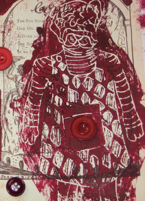
The finished cut! It's not traditional(See the Lino-cuts in my post The Maiden In The Tower), but with my Printed Ghetto cuts I'm using scissors to trim around the edge of the image so that there isn't a huge square of ink on the shirt or cushion I'm embellishing. I'm using my ink for fabric from The Indian Block Printing Company again, mixed with a really small amount of red. The correct way to print now is to apply the ink to the block with a roller (correct Printmaking name: brayer) then lay the paper or fabric over the printing block, it is then smoothed down using circular movements with a tool called a baren, although it's okay to use a wooden spoon. Because my prints are going onto a vest top, and it would be difficult to place them correctly, I am printing downwards onto the fabric. 

And here are my initial prints onto clothing! They are smoother and more defined than you can see in the photos. My intention is to print some smaller patterning around the hands, before embroidering into the print the same way that I did with my cushions. 


Initial prints onto shirt


I hope that this was useful if you are interested in making your own lino-cuts, and interesting if you like The Printed Ghetto. Please leave a comment as I would love to know what people think. Thank you for reading!


Saturday, 20 October 2012

Out Of The Strong Came Forth The Shadow Of The Apocalypse


In contrast to the cushion embroidery sweetness of my previous post, I will be writing today about THE APOCALYPSE. Or more specifically, a pretend film about a pretend apocalypse or revolution (it’s safer and equally fun really). I’ve been doing some promotional material for this film, with the idea that people may want to buy it and put it on the wall, where it will look down and make the room seem edgy and design orientated but also slightly violent.

This looks like it may be advertising violence, yep? 
This is the original photograph, there's no question it's much better in colour, but  I'm trying to keep the palette limited to monochrome for the time being because then I can afford to have them printed.
                                     
This is the background and border of the poster images. It's from a photograph I took from a window in the center of Manchester, thinking that the colours and the placing of the bridges looked very futuristic, and possibly post-apocalypse.

The reason this project began is because I was thinking about Che Guevara. I love Che Guevara, almost innappropriately. I love the semi-ubiquitous image on posters and flags and  the badges that the communists were flogging last year in Piccadilly, and I love his face in the regular photographs of him. I know he wasn’t a nice person, but that isn’t the point, because image of his face is iconic, and even though in principle any one of the rebel fighters in Cuba could have been photographed wearing a beret and looking into the distance, he’s the one that stands for revolution. This made me think about how any famous or iconic face is only there through chance, and anyone could be an iconic face. Later in this project, I hope to reference other themes that warrant promotional media, such as propaganda posters, and advertising for rock bands, but I’m starting with my imaginary film, you can decide what happens in it.


These images are square rather than rectangular, because that's their original composition, and I though that they made more impact as blog images, but I plan to place them on a oblong canvas for printing, as that's a more traditional shape for a poster. 

This photograph actually IS my sister, and most people who know her who have given me feedback have admitted to finding it mildly disturbing. She put the costume together herself and drew on the moustache and eyebrows.
I'm going to note here how I'm coming up with the slogans for my posters, because you are my special readers and can therefore be let in on some Trade Secrets. Well, semi-open if you have the internet secrets. I've been putting themes from the film, double identity, revolution, the apocalypse, into online slogan generators, and they tack meaningless advertising mush such as 'Brightens your day' onto the end. I was laughing for hours, and became concerned about what my neighbours would think as the walls are very thin. Here are some lovelies: 

'How many licks does it take to get to the center of the Shadow of the Apocalypse?'

'There's no wrong way to eat a double identity!'

'Easy, breezy, beautiful. Betray me and die!'

'1/10 of a revolution per minute-the other white meat.'

'The future is bright, the future is The Shadow of the Apocalypse.'

'Start YOUR day with the destruction of existence!'

Thank you for reading! I will update with links to my Etsy page once these have gone to print. Follow @PrintedGhetto on Twitter to see more poster designs.


Wednesday, 17 October 2012

Staring Creatures From The Ghetto

This week, my lovely, long neglected readers,  I'm going to tell you in some detail about how I made cushions. No- don't leave! I promise I will make it as interesting as cushion production can be. First, let me present my Printed Creatures. The birds have starey eyes, because the ghetto is dark.


These are Doris and Gerard. Doris is on the left. They say very little, probably because they are illustrations, but if they began to speak to me in a non-worrying-hearing-voices kind of way, they would be enigmatic.


This is Penelope, she's a bulldog. She doesn't have starey eyes, because that would indicate wide eyed naivety, and to me she looks cynical. You may have seen her before, if you came across the button cards.


Finally for now (I do have more creatures, but they are staying in the fictional ghetto, as they haven't yet been photographed) This is Henry the rabbit.

And now the cushions. I printed onto a recycled quilt I bought in a charity shop. (I suppose I thrifted and then upcycled it).


I printed the creatures onto the cushions using printing ink from The Indian Block Printing Company (www.theindianblockcompany.co.uk), which was very effective, it also has a nice shiny finish to it. It was a paler blue colour than the picture on the website, so I mixed it with some acrylic to make a deeper blue. 


Once I had my nice printed shapes on the cotton, I stitched around every contour I could reach with my sewing machine, then backed the print with some felt to make it stand away from the background more. On this particular cushion,  I gave Doris a kind of lacy black eye, and then embellished the background with some more stitching, over and around the existing pattern. I got a great thread set from Lidl, with lots of bright colours, which I used for this. This cushion is finished with some beads.


This cushion (featuring Henry) is the most heavily embroidered, with the most contrasting thread, and so far the only one I have given Coraline-style button eyes. The background of this one is outlined in fabric pen. Believe me, I needed a break from machine embroidery at this point. Current record of needles broken: Seven. In one day. 

Thank you for reading! I won't subject you to another blog post solely on cushion making, but if you would like to see more photographs as I make them, follow @PrintedGhetto on Twitter. I also post pictures of drawings and works in progress. If you are interested in buying a cushion,check out my Etsy page, OR my Folksy page